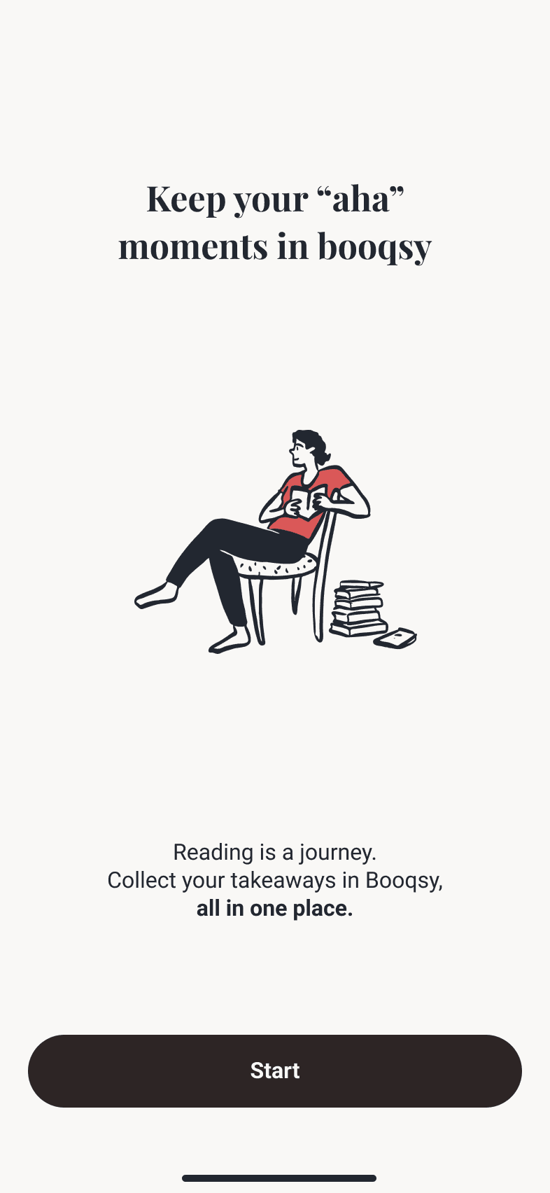
Your book companion
Booqsy
ROLE
Co-founder | Product manager | UX Designer
YEAR
2024


Background
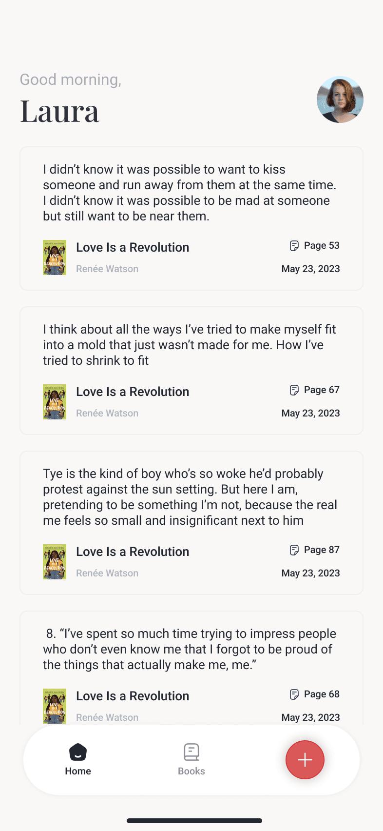
When we started Booqsy, the idea was pretty straightforward: make physical reading more interactive. We wanted readers to be able to capture their favorite highlights from physical books and organize them in a simple, clean digital space. You could call it a bridge between analog reading and the convenience of a digital library. But, as with any startup, it wasn't just about the idea—it was about testing whether this could become a product that people actually want.
Challenge
One of the biggest challenges we faced during development was ensuring that users could capture text from books accurately. Lighting conditions, the curvature of book pages, and the limitations of OCR technology all contributed to the difficulty of getting clean, accurate text extraction. Addressing this challenge was a major focus of our MVP iteration.
Real Feedback, Real Adjustments
One of the best pieces of advice from Steve Blank is to "get out of the building." We talked to our early users about their experiences, and a few things became apparent right away:
User Experience Friction
Capturing a good photo of a book page was harder than expected. Lighting conditions, shaky hands, and book binding made it frustrating at times. We decided to add a simple guide overlay to help users frame the shot correctly, which made a surprising difference.
OCR Challenges
The OCR worked mostly. But when it didn't, it was annoying enough to make people want to give up. We took this as a signal to work on a better OCR solution but also to introduce an easy manual correction option for when the text extraction inevitably messed up.
Organizing Highlights
Some people wanted more organization options. Tags were good, but others wanted folders or collections. Instead of building that right away, we added a feedback prompt to see how many users asked for similar improvements. This was key in understanding whether this was a true need or just a one-off.
What we learned
The MVP validated the core concept—people did want a way to capture highlights from physical books. But, more importantly, it highlighted the areas we needed to improve if we wanted to turn this into something people would use regularly. We learned that our core idea was sound, but the execution needed a lot more polish.
One big takeaway was that convenience was everything. If users had to struggle with capturing a highlight, they'd just stop. The value proposition was clear, but the friction points were real barriers. We also learned that while people liked the idea of organizing their highlights, the need for social features wasn't as strong as we initially thought. People seemed more interested in building their own personal collection than sharing it.
Conclusion - Next steps
We decided to focus our next iteration on improving the OCR accuracy and making the capture process as seamless as possible. We also prioritized adding features for personal organization, based on user feedback, rather than building out any kind of community or social components.
In the end, the MVP did exactly what it was supposed to do—it taught us what mattered most to our users. And honestly, it was humbling. There's nothing quite like seeing someone struggle with a feature you thought was "good enough" to make you realize just how much further you have to go.
But that’s what makes building something worthwhile. It’s never perfect, and it’s never done. You build, you learn, you iterate—and hopefully, somewhere along the way, you make something that people love.

Let's build together! 🙌🏻
If this story resonates with you and also you're an entrepreneur with a vision for building impactful apps, I'd be happy to share my experience and help bring your ideas to life. Drawing from my own journey, I understand the ups and downs.
I'd love to hear from you. I'm always interested in connecting with others who are passionate about solving real-world problems.
Feel free to reach out!